The legendary adman who designed the eatbigfish logo
Béla Stamenkovits. Photo: Marketing Tribune
Béla Stamenkovits died earlier this year. He was one of Holland’s, and Continental Europe’s greatest advertising art directors, and the creator of the original eatbigfish logo. It was a gift from him in 1999 to our nascent company.
Béla at the time was the Creative Director of TBWA Europe, a difficult job which he undertook with a patient professionalism that was counter-balanced by his fierce love of the creative work produced by his own agency, TBWA Campaign Company Amsterdam.
Like all brilliant Art Directors, he brought an uncompromising aesthetic to everything he designed, and every detail mattered: the creative floor of his agency had a single very long white corridor beside the creative teams’ offices, for instance, and Béla would not allow any door handles to the offices, because they would ruin the sight line along the corridor; one of his creative teams christened the flawless white length of the corridor ‘the particle accelerator’. He smiled, but I don’t think he really found it funny.
He and I had spent two years working closely on Apple and Nissan in Europe – I had been in Amsterdam two or three days a week – and one day in early 1999 told him I was leaving to start a company called eatbigfish with a couple of friends. Who’s doing your design? He asked. I told him I hadn’t really thought about it. I’ll do it, he said. I was slightly overwhelmed by this, to be honest; he was one of the most famous creatives in Europe. But yes, thank you, I said. That would be wonderful.
“Let’s start somewhere else, he said: why is it called eatbigfish?”
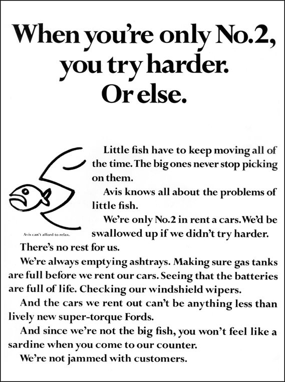
He asked me to share some examples of design I liked. So I sent him a book of Inuit Art; I explained that I wanted something noble (I liked that slightly old fashioned intentional value, and felt the advertising world had entirely lost it) – noble and slightly naïve. He thought this was hilarious. Let’s start somewhere else, he said: why is it called eatbigfish? I talked about the Avis ad of the big fish chasing the smaller fish, and why Avis was in effect the mother of all challengers, in that it and DDB had been the first brand to make it cool to be a number two.
The Avis ad from 1964.
Leave it with me, he said.
Two weeks later he came back with three different routes. The first was a drawing of a Neptune-like figure rising from the ocean with a trident/ fork in one hand, and a knife in the other. The second was a picture of a shark’s dorsal fin rising from the sea, with a bite taken out of the back of it. And the third was a little fish chasing the tail of a big fish, its mouth open to bite, drawn in the style of the original Avis ad, with predator and prey reversed.
And the name, eatbigfish, written in the typeface of the original Avis ad. Of course, said Bela (remember the particle accelerator), if you went with this route, you’d have to use that typeface. And that won’t be easy – it’s unique to Avis; you’d have to get permission from them.
Our original business card was a visual play on that 60s Avis press ad. The card was laid out portrait, not landscape, like a press ad would have appeared in a newspaper, and in cream card to match the colour of the original Avis ads. I can’t remember if Avis did, in fact, give us permission to use the typeface, but in practice loading it on our computers would have been too difficult, so we used the closest typeface we could get.
The first eatbigfish business card.
The card offered us a story to tell, every time we shared it, of who we were and why we were different. And how all of our thinking was rooted in really understanding the challengers who had passed this way before. And at the bottom of the card were the three cities we were born in: London, San Francisco and Madrid.
It was a wonderful gift. And I learned a little from that act of generosity, and still try to pass it on. I’d like to think that, while as a small business eatbigfish is of course a commercial enterprise, as individuals and as a company we all now deliberately make a practice of sharing and giving, in big and small ways. To friends, of course, but also to strangers who are early in their own companies or careers - through advice, shared learnings, potentially useful connections, even emergent ideas.
Bela was a wonderful talent. I admired him enormously. And I still love the gift he gave us.


